TreeID Dataset
Collecting and processing the tree data was a big learning experience. That’s the encouraging, optimistic way of saying that I made a ton of mistakes that I will never, ever repeat because I cringe at how obvious they feel in retrospect. This is still under active development and has attracted some outside interest, so you can follow along at the GitHub repo. So, what are we looking at here?
How was the data collected?
The beginning of this project was a collection of nearly 5,000 photos around my own neighborhood in Cleveland at the end of 2020. Not being an arborist, or even someone who leaves the house much, I hadn’t anticipated how difficult it would be to learn how to identify trees from just bark at the time. Because it was only of personal interest at the time, the project was put on ice.
At the end of 2022, I learned of a couple of helpful projects. The first and primary source of my data, the City of Pittsburgh paid for a tree inventory a few years ago. The species of tree, its GPS-tagged location, and other relevant data can be accessed as part of its Burghs Eye View program. It’s worth noting that Burghs Eye View isn’t just about trees, but is an admirable civic data resource in general. The second, and one which I unfortunately didn’t have time to use, is Falling Fruit, which has a bit of a different aim.
Using the Burghs Eye View map, I took a trip to Pittsburgh and systematically collected several thousand photos of tree bark using a normal smart phone camera. The procedure was simple:
- Start taking regularly spaced photos from the roots, less than a meter away from the tree bark, and track upward.
- When the phone it at arm’s reach, angle it upward to get one more shot of the canopy.
- Step to another angle of the tree and repeat, usually capturing about six angles of an adult tree.
Mistake 1 – Images too Large
Problem
The photos taken in Pittsburgh had a resolution of 3000×4000. An extremely common preprocessing technique in deep learning is scaling images down to, e.g. 224×224 or 384×384. Jeremy Howard in the Fast.ai course even plays with this, and developed a technique called progressive upscaling; images are scaled to 224×224, a model is trained on them, and then the model is trained on images that were scaled to a resolution more like 384×384.
I spent a lot of time trying to make this work, to the point where I started using cloud compute services to handle much larger images, to no avail. Ready to give up, I scoured my notebooks and noticed that some of the trees that the model was confusing more than the others looked very similar when scaled down to that size. It occurred to me that a lot of important fine details of bark was probably getting lost in that kind of compression. Okay, but so what?
Solution
Cutting the images up. I suspect this solution is somewhat specific to problems like this one. It doensn’t seem like it would be useful for classification purposes if you were to cut photos of fruit or houses into many much smaller patches. But tree bark is basically just a repeating texture. Even before realizing the next mistake, I noticed improvements by scaling down to 500×500 images, then finally a more drastic improvement by going down to 250×250.
In some ways this gave me a lot more data. If you follow the match, a 3000×4000 image becomes at most 192 usable 250×250 patches. I at first thought it was a little suspicious, but I looked around and doing it this way isn’t without precedent. There is a Kaggle competition for histopathological cancer detection where this technique comes up, for instance.
Mistake 2 – Too Much Extraneous Data
Problem
A non-trivial amount of this data got thrown out. At the time, I was working on the impression that the AI would need to take in as much data as it could. What I hadn’t considered was that some kinds of tree data, even some kinds of bark data, would be substantially more useful than others in classifying the trees. To borrow a data science idea, I hadn’t done a principle component analysis and wasted a lot of time. Many early training sessions were spent trying to get the model to classify trees based on images that included:
- Roots and irregular branches
- Soil and stray leaves
- Tree canopy that wasn’t specific
- Excessively blurry images
- Tree bark that was covered in lichen or moss, damaged, diseased
- Potentially useful, but at an angle or a distance that just got in the way
The end result was that it might require an inhumanly large dataset to achieve learning in any meaningful way. Early models could somewhat distinguish photos of oaks and pines in this way, but the results were too poor to be worth reporting.
Solution
Well, I ended up with two solutions.
The first was training a binary classifier to detect usable bark. The first time this came up, I was still working with the 500×500 patches, which worked out to just shy of 200,000 images. Not exactly a manual number, but I’ve never seen an ocean that I didn’t think I could boil. I spent an afternoon sorting 30,000 images, realized I had only sorted 30,000 images, and then realized I accidentally made a halfway decent training set for a binary classifer.
That classifier sorted the remainder of those images in under an hour.
The second solution was, unfortunately, quite a bit less dramatic. It involved simply going through the original photos, picking out the ones that basically weren’t platonic bark taken at about torso level, and just repeating the process of dividing them into patches and feeding those into the usable bart sorter.
So, what does it actually look like?
Alright, we’re getting into a little of the code. First, we need to import some standard libraries. I’ll do some explaining for the uninitiated.
pandas handles data manipulation, here mostly CSV files. If you’ve done any work with neural networks before, you might have seen images being loaded into folders, one per class. I personally prefer CSV files because they make it easier to include other relevant things besides just the specific class of the image. I’ll show you an example shortly.
matplotlib is a library for annotation and displaying charts.
numpy is a library for more easily handling matrix operations.
PIL is a library for processing images. It’s used here mostly for loading purposes, and we can see that because we are loading the Image class from it.
import pandas as pd
import matplotlib.pyplot as plt
import numpy as np
from PIL import Image

import os
Something that was really helpful was the use of confidence values. For every patch that the usable bark sorter classified, it also returned its confidence in the classification. Looking at the results, it had a strong inclination to reject perfectly usable bark, but it also wasn’t especially confident about those decisions. We can use that to our advantange by only taking bark that it was very confident about.
def confidence_threshold(df, thresh=0.9, below=True):
    if below==True:
        return df[df['confidence'] < thresh]
    else:
        return df[df['confidence'] > thresh]
Loading the Data
What these files will ultimately look like is still in flux. Today, I’ll be walking you through some older ones that still have basically what we need right now. First, we load the partitions that were accepted or rejected by the usable bark sorter. We also do a little cleanup of the DataFrame.
reject_file = "../torso_reject.csv"
accept_file = "../torso_accept.csv"

reject_df = pd.read_csv(reject_file, index_col=0)
accept_df = pd.read_csv(accept_file, index_col=0)

accept_df
I accidentally goofed up when generating the files by accidentally leaving a redundant “.jpg” in a script. The files have since been renamed, but because we’re using older CSVs, we need to make a quick fix here. The below is just a quick helper function that pandas can use to map to each path in the DataFrame.
def fix_path(path):
    path_parts = path.split('/')

    # Change 'dataset0' to 'dataset'
    #fn[0] = "dataset"

    # Remove redundant '.jpg'
    fn = path_parts[-1]
    fn = fn.split('_')
    fn[1] = fn[1].split('.')[0]
    fn = '_'.join(fn)
    path_parts[-1] = fn
    path_parts[0] = "../dataset"
    path_parts = '/'.join(path_parts)
    return path_parts
accept_df['path'] = accept_df['path'].map(lambda x: fix_path(x))
reject_df['path'] = reject_df['path'].map(lambda x: fix_path(x))
And just to make sure it actually worked okay:
accept_df['path'].iloc[0]
Alright, so what’s this?
accept_df
reject_df
Around 108K patches were accepted, and around 93K were rejected. Looking at the confidence column, we see that there are a few that the model is somewhat uncertain about some of these. Let’s take a look at that.
First, we need a couple more helper functions. This one opens an image, converts it to RGB, resizes it to something presentable, and converts it to a numpy array.
def image_reshape(path):
    image = Image.open(path).convert("RGB")
    image = image.resize((224, 224))
    image = np.asarray(image)
    return image
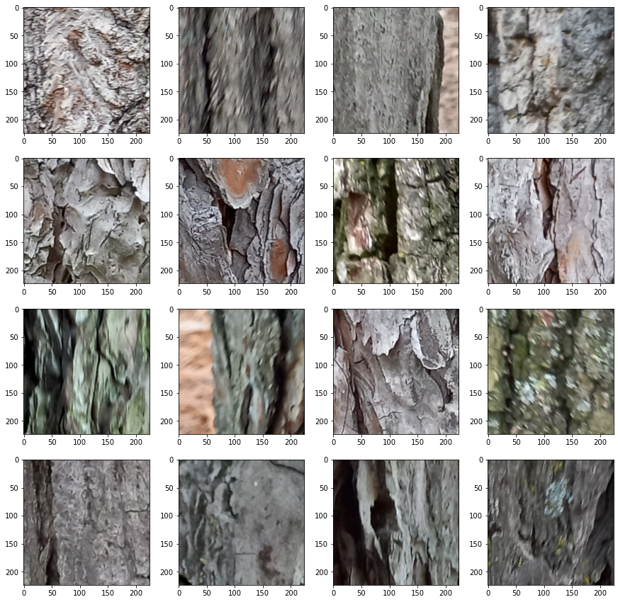
Next, it will be helpful to be able to see a few of these patches at once. This next function will get patches in batches of 16 and arranges them in a 4×4 grid with matplotlib.
def get_sample(path_list):
    print("Generating new sample")
    new_sample = np.random.choice(path_list, 16, replace=False)

    samples = []
    paths = []
    for image in new_sample:
        samples.append(image_reshape(image))
        paths.append(image)
    return samples, paths
get_sample() takes a list of paths, so let’s extract those from the DataFrame.
reject_paths = reject_df['path'].values.tolist()
accept_paths = accept_df['path'].values.tolist()
samples, paths = get_sample(reject_paths)
plt.imshow(samples[1])
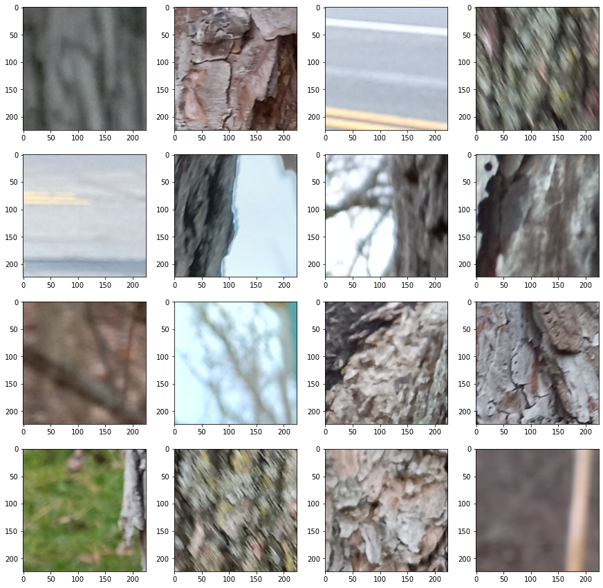
Okay, let’s see a whole grid of rejects!
def show_grid(sample):
    rows = 4
    cols = 4
    img_count = 0
    fix, axes = plt.subplots(nrows=rows, ncols=cols, figsize=(15,15))

    for i in range(rows):
        for j in range(cols):
            if img_count < len(sample):
                axes[i, j].imshow(sample[img_count])
                img_count += 1
def new_random_grid(path_list):
    sample, paths = get_sample(path_list)
    show_grid(sample)
    return sample, paths
sample, paths = new_random_grid(reject_paths)
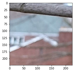
These are samples of the whole of the rejects list. I encourage you to run this cell a bunch of times if you’re following along at home. You should see a goodly number of things that aren’t remotely bark: bits of streets, signs, grass, dirt, and other stuff like that. You’ll also see a number of patches that are bark, but aren’t very good for training. Some bark is blurry, out of focus, or a part of the tree that I later learned wasn’t actually useful.
A fun thing to try is to see the stuff that the model rejected, but wasn’t very confident about.
reject_df_below_85 = confidence_threshold(reject_df, thresh=0.85, below=True)
reject_df_below_85_paths = reject_df_below_85['path'].values.tolist()
sample, paths = new_random_grid(reject_df_below_85_paths)
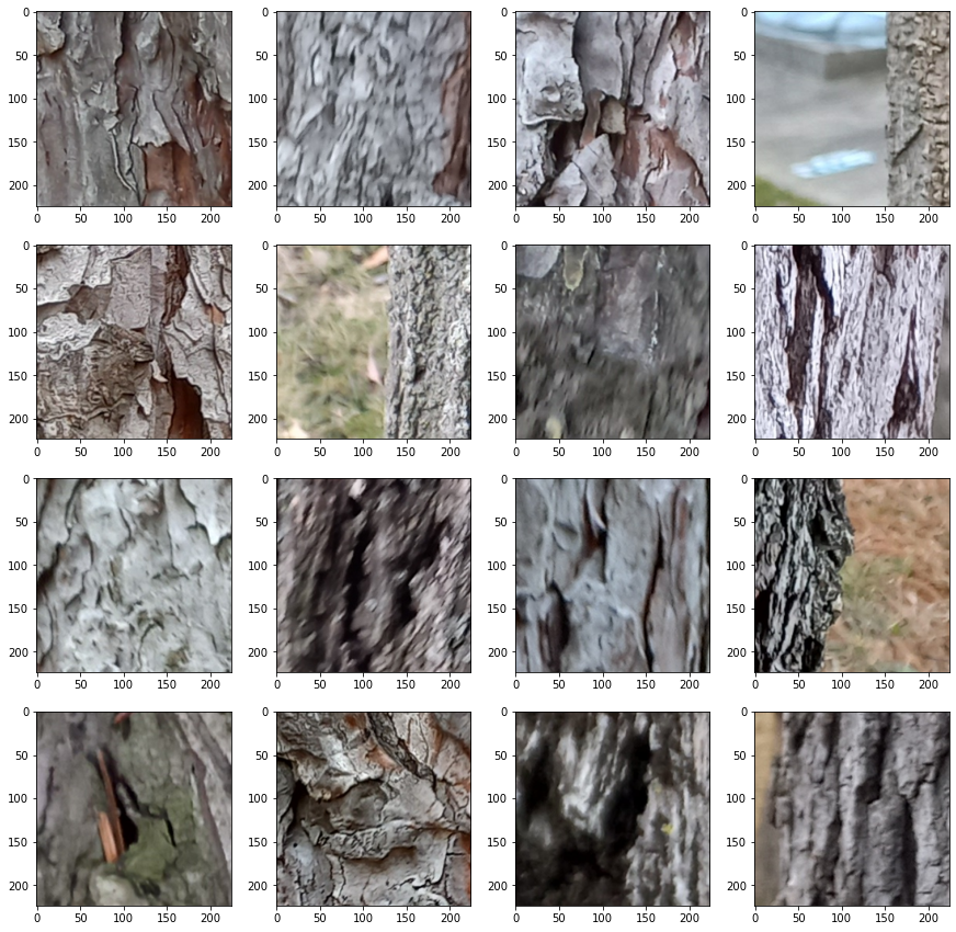
Running this just once or twice usually reveals images that are a bit more… On the edge of acceptability. It’s not always clear why something got rejected. I haven’t ended up doing this yet, but something in the works is examining these low-confidence rejects in either training or, more likely, testing of the model. Mercifully, there is enough data that was unambiguously accepted that doing so hasn’t been a pressing need.
Speaking of, we should take a look at what got accepted, too.
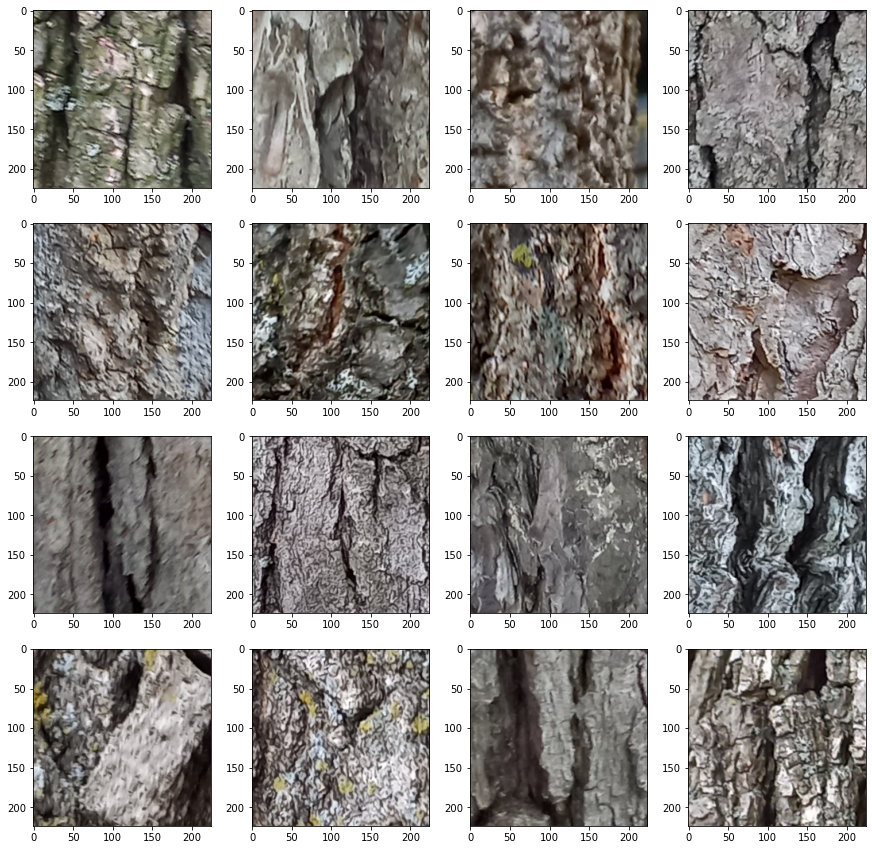
sample, paths = new_random_grid(accept_paths)
As above, these are all of the accepted bark patches, not just those that have a high confidence. Let’s see what happens when we look at the low-confidence accepted patches.
accept_df_below_65 = confidence_threshold(accept_df, thresh=0.65, below=True)
accept_df_below_65_paths = accept_df_below_65['path'].values.tolist()
sample, paths = new_random_grid(accept_df_below_65_paths)
Here we see that bias that I was talking about before. Note that when we were looking at the rejected bark, we were looking at patches that were divided by a threshold of 0.85 and were already seeing a lot of patches that could easily be accepted. Here, we are looking at a confidence threshold of 0.65 and are still not seeing many that would definitely be rejected.
The cause of the bias is unknown. I made it a special point of training the usable bark sorter on a roughly even split of acceptable and unacceptable bark. Because this was just a secondary tool for the real project, I haven’t had time to deeply investigate why this might be. I suspect there is some deep information theoretical reason for why this happened, perhaps one that will be painfully obvious to any high schooler once the field is more mature. The important thing now is it’s a quirk of the model that I caught early enough to use.
And what do these patches represent?
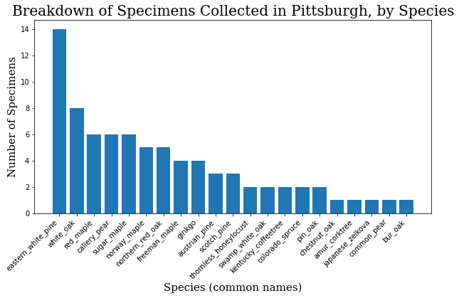
Having seen the images we are working we, it might be a good idea to look at what species we’re actually working with.
specimen_df = pd.read_csv("../specimen_list.csv", index_col=0)
specimen_df
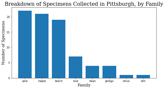
Okay, I took photos of 79 different trees. It was actually 81, but the GPS signal on the last two was too spotty to match them on the map, and they had to be excluded. How can we break this down?
family_names = specimen_df.family.value_counts()
family_names = family_names.to_dict()
f_names = list(family_names.keys())
f_values = list(family_names.values())

header_font = {'family': 'serif', 'color': 'black', 'size': 20}
axis_font = {'family': 'serif', 'color': 'black', 'size': 15}
plt.rcParams['figure.figsize'] = [10, 5]

plt.bar(range(len(family_names)), f_values, tick_label=f_names)
plt.title("Breakdown of Specimens Collected in Pittsburgh, by Family",
         fontdict=header_font)
plt.xlabel("Family", fontdict=axis_font)
plt.ylabel("Number of Specimens", fontdict=axis_font)
plt.show()
When I started training, it made sense to start training focused on the family level. A family will inherently have at least as many images to work with as a species, and usually many more, and I had the assumption that variation would be smaller within the family. Interestingly enough, at least within this dataset, the difference in the quality of the model at the family and species levels has so far been negligible.
common_names = specimen_df.common_name.value_counts()
common_names = common_names.to_dict()
c_names = list(common_names.keys())
c_values = list(common_names.values())
plt.bar(range(len(common_names)), c_values, tick_label=c_names)
plt.title("Breakdown of Specimens Collected in Pittsburgh, by Species",
         fontdict=header_font)
plt.xlabel("Species (common names)", fontdict=axis_font)
plt.ylabel("Number of Specimens", fontdict=axis_font)
plt.xticks(rotation=45, ha='right')
plt.show()
The Model and Dataset Code
Full code can be found on the GitHub repo, but here are some important parts of the training code. First, because we are using a custom dataset, we need to make a class that will tell the dataloaders what to do. Some of this might need a little bit of explaining.
We have to import some things to make this part of the notebook work. BarkDataset inherits from the Dataset class. To initialize it, we only have to bring a given DataFrame, e.g. accept_df into the class. I’ve shown before that CSVs will let us work with a lot of other data that goes into the support and interpretation of the dataset, but BarkDataset itself only needs two things: the column of all the paths of the images themselves, and the column that defines their labels.
You might be a little confused about the line self.labels = df["factor"].values. The full code converts either the species-level or family-level specimens into a numerical class. For example:
"eastern_white_pine": 0
The label is the 0. When making predictions, we will convert back from this label for clarity to the user, but that isn’t how the model sees it.
After loading the DataFrame, we also define a set of transforms in self.train_transforms. At minimum, this is where we scale images down to 224×224 and normalize them. If you’re wondering, the values for normalization are standard in the field from ImageNet statistics.
In addition to these standard changes, transforms also has a wide variety of transforms that facilitate data augmentation. We can use data augmentation to give us more information from a base dataset; we just need to keep in mind to introduce the kinds of variability that would actually occur in the collection of more data.
You’ll notice two other methods in this class: __len__ and __getitem__. The former just returns the number of items in the DataFrame. The latter is where a single image is actually loaded using Image from the PIL library, and the label is matched from that image’s location in the DataFrame. The transforms are then applied to the image, and we get both the loaded image and its label returned in a dictionary.
import torch
from torch.utils.data import Dataset, DataLoader
from tqdm import tqdm

class BarkDataset(Dataset):
    def __init__(self, df):
        self.df = df
        self.fns = df["path"].values
        self.labels = df["factor"].values

        self.train_transforms = transforms.Compose([
            transforms.ToTensor(),
            transforms.Resize((224, 224)),
            transforms.RandomHorizontalFlip(),
            transforms.RandomRotation(60),
            transforms.ColorJitter(brightness=0.5, contrast=0.5, saturation=0.5, hue=0.5),
            transforms.Normalize(mean=[0.485, 0.456, 0.406],
                                std=[0.229, 0.224, 0.225]),
            ])

    def __len__(self):
        return len(self.df)

    def __getitem__(self, idx):
        row = self.df.iloc[idx]
        image = Image.open(row.path)
        label = self.labels[idx]

        image = self.train_transform(image)

        return {
            "image": image,
            "label": torch.tensor(label, dtype=torch.long)
        }
Next, we’ll look at the model. The model can be expanded in a lot of ways with a class of its own, but at this stage of the project’s development, we are just starting with the pretrained weights and unchanged architecture as provided by timm.
model = timm.create_model("deit3_base_patch16_224", pretrained=True, num_classes=N_CLASSES)
model.to(device)

criterion = nn.CrossEntropy
optimizer = optim.SGD(model.parameters(), lr=0.001, momentum=0.9)

scheduler = optim.lr_scheduler.CosineAnnealingWarmRestarts(optimizer, T_0=100, T_mult=1,
                                                        eta_min=0.00001, last_epoch=-1)
model, history = training(model, optimizer, criterion, scheduler, device=device, num_epochs=100)
score = testing(test_df, model)
Now, I’ve gone through a lot of iterations of the various components here. Just off the top of my head:
- I first started using an EfficientNet architecture, but got curious to see how one based on vision transformers would compare, and it wasn’t really a contest.
- I originally used an Adam optimizer. Training with vanilla SGD proved slower, but also gave more consistent results.
- I’ve settled on cosine annealing as a learning rate scheduler, but also have intermittent success with CyclicLR and MultiCyclicLR.
- Most recently, I’ve been wondering if cross-entropy is the right loss metric. I quickly replaced accuracy with ROC because there are multiple, imblanaced classes in the full dataset. I suspect this also has implications for training, but have so far not found a loss metric that works better.
Changing the parameters here is still an active area of my research.
Results
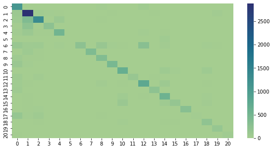
This is a confusion matrix of the results so far. It plots the predicted label against the actual label, and makes it a little easier to see where things are getting mixed up. Ideally, there would only be nonzero values along the diagonal.
#!pip install seaborn
import confusion_stuff
import seaborn as sn

matrix = confusion_stuff.matrix

ind = confusion_stuff.individuals
ind = {k: v for k, v in sorted(ind.items(), key=lambda item: item[1])}
ind_keys = ind.keys()
ind_vals = ind.values()

df_cm = pd.DataFrame(confusion_stuff.matrix)
sn.heatmap(df_cm, cmap="crest")
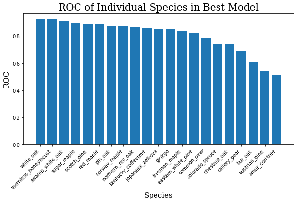
The average ROC for this model across all 21 species is about 0.80. For reference, a 1.0 would be a perfect score, and 0.5 would be random guessing. The graphis is somewhat muddled because there are so many classes, so you can see the scores for individual classes below.
for i, j in zip(ind_keys, ind_vals):
    print(f"{i}: {j}")
ind_keys = sorted(list(ind_keys))
ind_vals = sorted(list(ind_vals))
ind_keys.reverse()
ind_vals.reverse()
plt.bar(range(len(ind_keys)), ind_vals, tick_label=ind_keys)
plt.title("ROC of Individual Species in Best Model",
         fontdict=header_font)
plt.xlabel("Species", fontdict=axis_font)
plt.ylabel("ROC", fontdict=axis_font)
plt.xticks(rotation=45, ha='right')
plt.show()
Having plotted these, it’s not hard to see where the model is weak.
Next Steps
I’m still trying new things and learning a lot from this project. Some things on the horizon:
- Trying one of the larger DeiT models.
- Ensemble method: training a number of classifiers with a smaller number of classes and having them vote using their confidence scores.
- Ensemble method: break one large test image into patches, have models vote on each of the patches, and use the majority, the highest confidence, or some other metric as the prediction.
- Gathering more data, especially expanding to include more species.
- Weird idea: information theoretical analysis of the tree bark.
Early days!
